'MyWorkspace'
A customer service solution for front-line employees
Overview
-
A multinational bank
through NTT Data consultancy
-
2020 - 2021
~ 18 months
- Sketch / Axure RP
- Miro
- Jira Confluence Zeplin
-
Myself + 3 other NTT designers
Mix of UX and UI designers -
Global design teams
10+ designers in China, IN, CA -
Global project team
PO, PM, BAs, Devs... in UK, CN, CA
- Covid - adapting to full remote
- High turnover in leadership team
- Intricate backend systems
- Signed-off fundation work - MVP
- Buy-in from sponsors (funding for next phases)
- Users involved in all phases
My role
Lead Product Designer
I was embedded in a project team with four other NTT Data designers (mix of UX and Visual designers). My contributions were as follows:
- Collaboratively defined the overall user experience
- Responsible for designing specific areas of the product (end-to-end, focusing more on UX questions)
- Guidance to designers from the client teams (remote in India, China and Canada)
- Supported programme level decisions: roadmap and prioritisation, refining the scope for the MVP, workflow improvements, identifying risks etc.
Project summary
A multinational bank wanted to transform the way its frontline staff deal with customers’ queries (branch or contact centre staff). The goal was to replace a range of over 40 disparate legacy applications with a single, efficient and easy to use solution. We worked closely with end-users during all phases from discovery to delivery: creating concepts, refining our designs, until the delivery of MVP designs for the key markets.
The problem

Across the group, hundreds of different applications are used in branches and contact centres. Having so many systems is ineffective, costly to maintain, and entailed many risks for the business (operational, compliance, reputational). Some systems are dated and their support is coming to an end - another reason for the bank to solve this issue at pace.


The solution
Discovery / research
This project initially started in 2016. It was paused until 2020 when we joined. The initial team ran the first round of research activities. Some early concepts for a new integrated solution were produced and tested at this time.
The systems and ways of working hadn't changed when the programme was relaunched in 2020. So all these findings were still relevant.
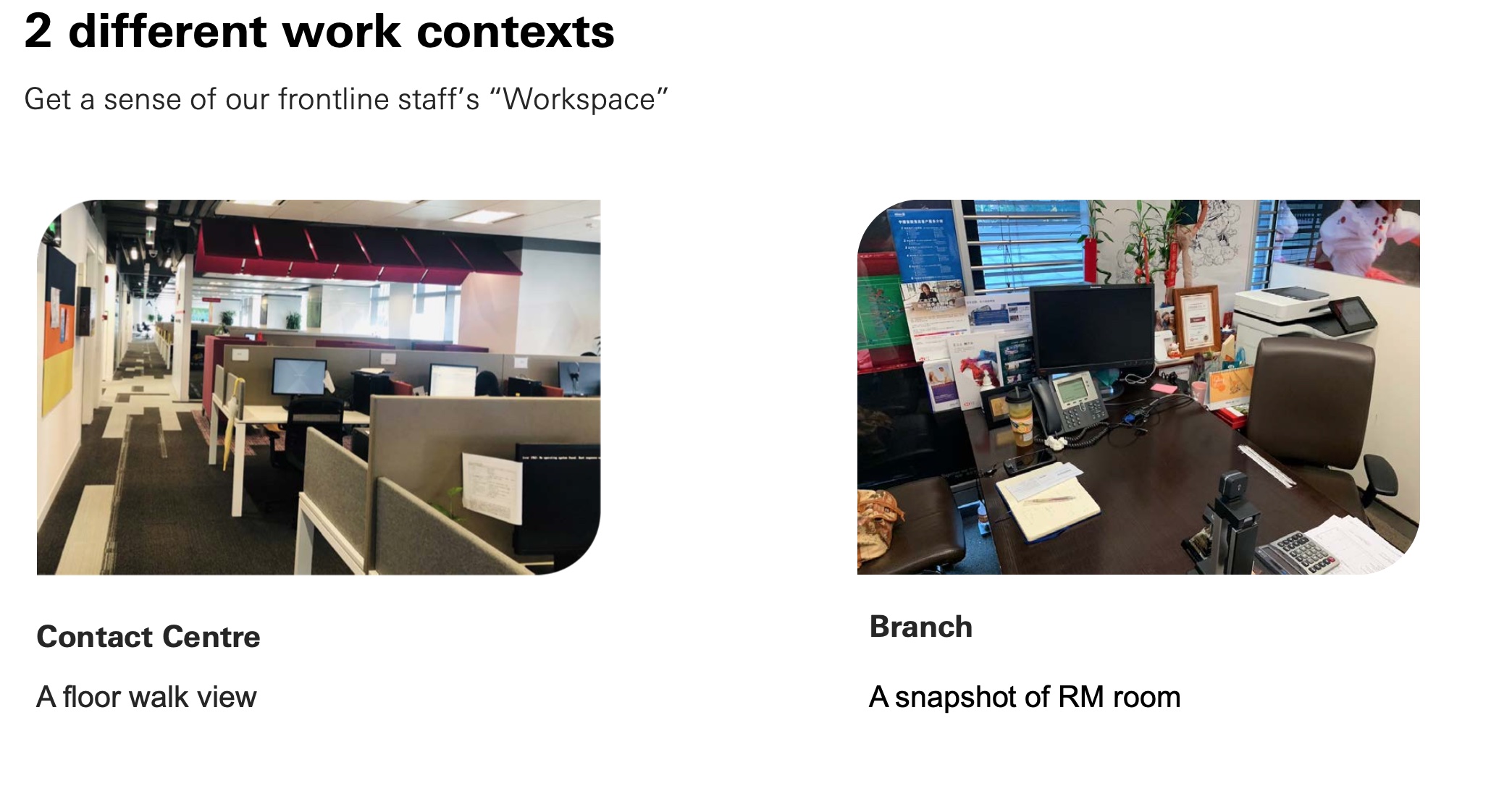
For the first release, we focused on two 'user archetypes':
- contact centre employees (mostly dealing with inbound phone calls), and
- branch staff, more specifically the so-called “universal bankers”
In summer 2020, a design team based in China joined the project. They were able to conduct more research - some insights below:
Team and Ways of working
Team structure all along the project duration
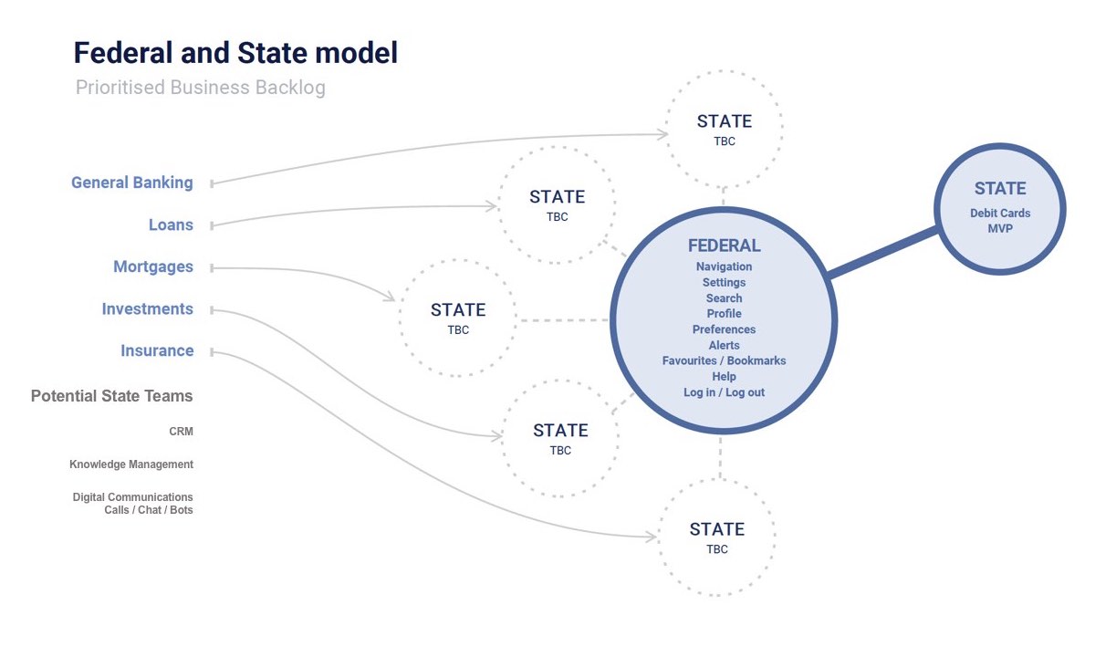
Originally two of my NTT colleagues started as the only design team on this programme. As the client realised they’d need a lot more design inputs, they expanded our team (more designers, BAs, PM, and architects from our consultancy - NTT Data UK).
When the team started to grow, we organised our work into a Federal/State model (see below).
I was in charge of the design work on the first ‘states’. I also supported my colleagues’ design efforts on many of the ‘federal’ components or journeys they had started working on.
Collaboration tools
We used Miro where our boards grew organically. I rearranged them after a while to bring a bit of structure. Our main activities on the general board included:
- competitor analyses
- Exploration on the layout and components
- Phase 1 - requirement gathering, information architecture
Workshops: presentation of concepts, ideation, feedback, etc. - Phase 2 - future concepts
- General project planing - backlog, estimates
We also had many other collaborative boards dedicated to more specific journeys or concept.

Collaboration with other design teams
When the team from China joined the project, it quickly became obvious we needed to establish new ways of working, with more alignment sessions and more sharing of our understanding and design rationale. A general process was agreed upon to ensure we were all working in line with the overall design principles and the bank design standards.
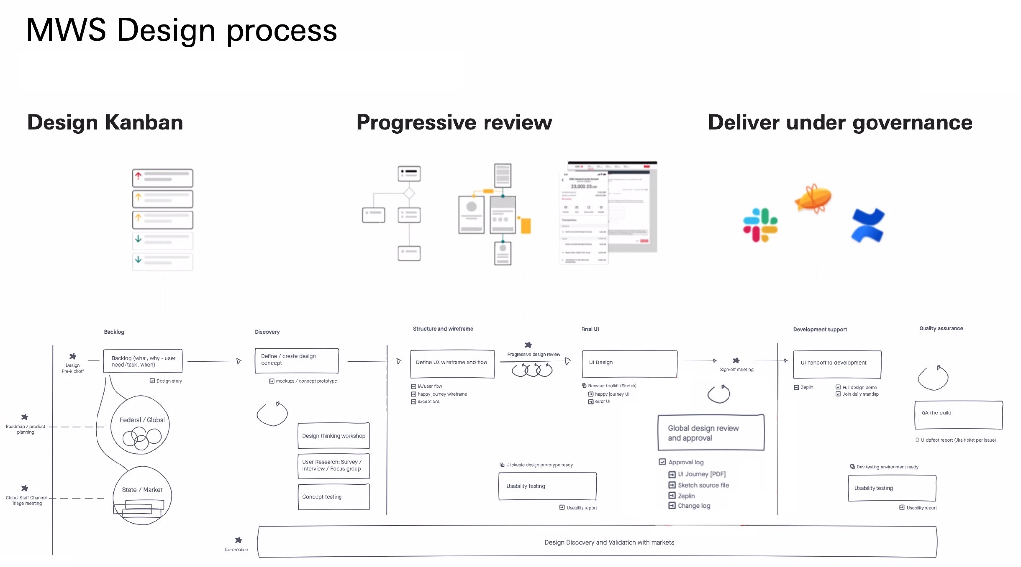
Iterations on the designs
Design artefacts are rarely set in stone. From concept screens to prototypes, or even wireframes and final designs, there is always something to iterate on:
- During the first phase, we refined our deliverables based on the feedback from our sessions with end-users, PO and SMEs, but also from comments or requirements clarifications coming from the BA team and tech leads.
- Later on, after user testing was performed, we used its findings to improve our overall solution
Agile rituals, Dev handover and QA
A daily standup was set up with the BA team and Front End lead (all Canada-based).
Once designs were approved by the business we reviewed them with the dev teams so they could ask questions. The UI components were uploaded to Zeplin.
During the development phase, we requested frequent demos. We also had access to a test environment. This way we could provide rapid feedback either during our daily standups or in a more formal way (e.g. UI defect report, design vs. implementation).
Contributions
Workshops
We ran regular workshops with each market (UK, US and later HK: so two or three weekly sessions). Staff from branches and contact centres - our key users for MVP - always attended the sessions. We also interacted a lot with other SMEs like staff managers, or experts in the current systems.
In the initial rounds, we were mostly reviewing answers to a set of ‘surveys’ the PO had initiated.
Although these sessions helped to refine the requirements, they were lacking context: the focus was too much on features, rather than on users’ journeys or tasks. So, we took over and started probing about existing journeys and reviewing concept screens to get feedback and insight on the reason our users needed specific data, or on how they or their customers interacted with the systems.
I regularly took the lead, driving users through scenarios (for the key journeys we had identified), sharing concepts, and uncovering the reasons behind some of the initial requests. This was a way to supplement any contextual enquiries or walkthrough sessions we might have had without Covid.

At first, some stakeholders were a bit uncomfortable with having so many questions asked. They quickly realised how, through design, these would translate into more appropriate solutions: hierarchised information (rather than displaying everything upfront), a product tailored to user needs (rather than a “lift and shift” of previous systems), etc.
Layout, navigation and other ‘federal’ parts
We put a lot of thought into the ‘MyWorkspace’ global layout. Based on our assumptions (content to be displayed, multitasking scenarios), we defined a multi-column environment:
- the core content/journeys using the central space, and supporting journeys or data would be on the sides.
- The navigation at the top included a product level header, a customer session header and a tabs bar area.

Research had confirmed our users worked either on desktop (laptop + external screen) or on tablet ‘landscape’ (with a decent screen resolution). So we designed these components to be responsive, at least to cater for these devices (but not for mobile).
I supported the work on many other aspects of the global product. One example was the definition of a 'tile' template.
I also helped with components such as tabs and tabs management, or with the navigation between different customer profiles (see figure below).

While my colleagues were defining the main navigation patterns and components, I focused on other areas of the product described in the following sections.
Card servicing
(1 PM, 2 BAs, 1 Visual designer, 1 remote designer, dev team)
I initially worked on a separate ‘Card servicing’ initiative for a few months. I designed journeys linked to debit card requests managed in HK contact centres (e.g. staff dealing with customers wanting to report a lost or stolen card, replacing a card, managing their card limits etc.).

I collaborated with and led the work of a Visual Designer from our NTT team. The development team had already started working on this initiative. So, our main goal was to urgently deliver our designs. We mostly used a library of well-defined components (the bank relies on a mature design system). So producing wireframes and final designs didn’t require many iterations, and our designs were approved in time by the ‘Digital Design’ governance team.
Guidance/mentoring
On this work stream, I oversaw the work of a remote designer focusing on smaller journeys. She was based in India and directly employed by the bank. She was a junior designer with very little experience and limited access to, and knowledge of, the appropriate tools. So I got her up to speed and guided her in her first design assignment as much as I could. Once I had defined all the main design patterns (such as global navigation, simple edit journey, more complex requests with step tracker, etc.), the PM assigned this piece of work to other internal teams.
Account management pages
I redesigned Customers’ accounts related journeys.
With the current solution, for a given journey, the users had to look for account information in several locations, launching queries to various systems along the way.
Using ‘MyWorkspace’, the idea was to enable the users to navigate to a ‘hub’ page for a given account - where they could deal with the account in one place (key information on the account, settings management, associated cards, transaction history, etc.).
As mentioned above, we ran many sessions on this topic to clarify the requirements and co-create a solution. We reworked the information architecture: creating sections and grouping relevant data together.
I sketched various options for these pages and presented the users with concepts or prototypes we would review and iterate on. For the MVP, most journeys weren’t in scope end-to-end. We had to work with a ‘link-and-launch’ approach. This was reflected in our user flows.

For all the different areas of the account management, I produced wireframes (directly using the bank’s Design toolkit, as only a few elements within a page/tab needed more UI refinement). We iterated on the solution with the users, PO and BAs to ensure all the requirements were met (for the UK market to start with).
I collaborated closely with our visual designer to get the final UI designs approved. Then, we handed them over to the BA and dev teams (Zeplin, Jira/Confluence), and checked the implementation was correct.


The user testing revealed some issues with the amount of data presented on a single page. I initially warned the client about this potential issue, but they had a strong inclination to follow a "minimum clicks" approach… Relying on this feedback from actual users, I proposed alternative designs. One approach consisted in helping the users jump to the right section more easily (explored this option in prototypes - see below), and the other approach - my original suggestion - was to separate transactions from the rest of the account overview.

Product / service design opportunities
During these sessions, I also spotted a few opportunities to bring our work toward a Service design approach. For instance, one of the bank’s objectives was to decrease their customers’ dependence on staff support and to drive them to use digital channels. In the current situation, bank staff spotting a customer depositing a cheque via an ATM would let them know about the mobile banking option for this. I suggested this guidance should be integrated into the ATM journey itself. The SMEs were very interested in this idea. Following up on that idea, the client requested our NTT team to work on a new generation of ATMs as they wanted to explore how these could be integrated in ‘MyWorkspace’.
Memos
The users needed to keep track of their work on a customer profile, they also needed to collaborate with colleagues asynchronously. ‘Memos’ were the retained solution to answer these needs. I ran sessions with the US and UK markets which used the existing tools in slightly different ways. I iterated on concepts and refined them into designs accommodating various markets.
In my concepts, I included advanced functionalities to enhance the user experience. Some of them were too complex to be implemented in an MVP, so I took a phased approach with my specifications (simplified “bronze” version + increments in terms of complexity “silver” and “gold” solutions). For this specific part of the product, I prototyped the memo panel behaviour (in Sketch) so the users could comment on several aspects: data density vs. scrolling, filtering patterns, pagination behaviour, etc.

Insight and markers
Another key part of the product I contributed to was the “insights and markers”. The requirements for this functionality were quite fuzzy, mostly being a list of all markers available in legacy systems. So as a first step, I reviewed around 100 elements with the users and we categorised them in various buckets (see board below: customer markers, account markers, insight or action, channel usage, etc.)

Then and more importantly, we clarified the usage of each piece of information and prioritise all this content (triage with the users and SMEs). This way I could keep only useful and high-priority elements on the main customer profile page: ‘channels’ usage was displayed with other information on a customer overview panel, while a handful of key insights or actions (if any available) were displayed in a dedicated “tile” on the main content area.

Other markers, when applicable, were displayed in context (e.g. in the tiles for account markers, or in the customer bar for customer level ones).


Constraints and challenges
Changes to the project team
- the main product owner retired after one year
- the programme lead, two key SMEs, and the ITPM moved to new roles along the way
- an entire design team joined 6 months in, and took over some workstreams
Covid-19 restrictions
- Adapting to new ways of working
Scope and MVP definition
- the markets we targeted for the MVP changed twice
- Timelines and delivery expectations were sometimes unrealistic.
- Consequently, we spent a lot of time redefining expectations.
- Some remote teams didn’t and ended up delivering suboptimal designs.
- When realising timelines weren't achievable, the PO and PM had to often reprioritise. - Limited scope for MVP, but designing for a very generic tool, lack of global visibility
Numerous intricate backend systems
- This meant we couldn’t decommission older systems in one go.
The new MWS experience had to co-exist with various legacy journeys and UI. - A dictated “link and launch” approach prevented us from delivering a fully cohesive experience (what a ‘smaller end-to-end journeys' approach could have enabled)
Results
Reusable foundation work
- We delivered all the core behaviour, navigation and principles covering the federal items and the ‘customer session' landing page. We also provided templates for generic ‘product’ or ‘details’ pages.
- We shared an approved UI toolkit with the various design teams on this project. This enabled them to produce more journeys while being aligned with the core experience.
Buy-in from senior sponsors
- Sharing our work early and often, and in engaging ways (videos, prototypes) allowed the PO to secure more funding for future phases and to extend the scope of work.
Buy-in and involvement from end-users
- Proper UCD process with users involved at all stages, research, co-creation, testing, iterations and so on. We were very happy with this, as this is not a given in all projects
- Users advocating for our team to get involved in more projects
- During our workshops, the users were amazed by some of our proposals. We heard very positive reactions such as:
- “When can I get this?”
- “This would change our life”
Designs + MyWorkspace ‘phase 1’ delivered
- We delivered the MVP designs and followed the implementation of a first version of the product for the UK market
- This included co-existence with the older systems - we collaborated closely with architects and technical teams
- Approved by the business stakeholders, and the bank ‘Digital design’ governance

Accessibility, and D&I considerations
- All our designs took accessibility issues into account. The bank aims to deliver AA-accessible products. We obviously followed these standards for a staff experience product as much as we did on consumer-facing ones in the past.
- During our workshops, we discussed ID fields related to the customer’s gender as well as their 'preferred greetings', I raised concerns about potential confusion around those fields and the various nomenclatures. Some improvements required at the backend level were then planned.
Learnings
Fully remote works well
- ...even if we didn’t expect 18 months of it.
- It can be as effective as in-person, and better for some activities (easier to get access to stakeholders/users).
Customer service in banking requires a ton of knowledge
- I would never have guessed how much expertise these roles require (knowledge of products, systems, procedures and so on)
Design is still misunderstood even in large groups
- The bank we worked for had mature design processes, systems and governance.
Nonetheless, we faced: - PO/PM hindering good design practice by dictating design principles or preventing necessary steps to happen
- Out of touch expectations in terms of timelines
- Confusion between concepts and signed-off deliverables
- BAs working on requirements only after the designs were ready
- When possible, we educated the stakeholders on the role of design and on what is required for a healthy process - we improved the global ways of working.