'4-Flight'
A critical Air Traffic Management system
6 min read
Overview
- DGAC - DSNA
The French Civil Aviation Authority
- 2011 - 2014
~ 3 years
- Illustrator & Inkscape :D
- Flipcharts, Powerpoint
- Myself, hybrid role:
Product designer, UX consultant
/ PO assistant - The 4-flight PO + a global PO
+ Controllers and SMEs - System provider's ATM team
- Initial product was a collection of disparate features
- Political battles | Resistance to change
- Technical limitations | Aggressive timelines
- Acceptance from the controllers
who were about to reject the solution altogether - Definition of the industrial version
- 4-flight was delivered and an overall success
Project summary
"4-Flight" is a critical ATM system for DSNA, France's primary Air Navigation Services Provider.
DSNA had selected this 'off-the-shelf' ATM system from an industrial provider. To refine the overall product design, we ran collaborative workshops with our end-users - Air Traffic Controllers (ATCOs) managing en-route traffic. With a multidisciplinary team, we defined which tools were the most relevant and shaped new ways of working for the controllers. We worked closely with them to iterate and make this supervision tool more usable and efficient. We tested it on a real-time simulator until operational acceptance.
This key transformation programme was a success: a few years later, the first 'real' flights were controlled using this solution in France.
My role
Product designer
Hybrid role: UX consultant, Product Owner assistant, Digital BA
I worked client-side embedded within a team of civil servants from the DGAC/DSNA.
I was the only "HMI expert" consultant on this top priority programme.
DGAC is the French Civil Aviation Authority. One of its entities, DSNA is France's main Air Navigation Services Provider (ANSP, providing air traffic control, communication and information services). Within the DSNA, I worked for the “Direction de la Technique et de l’Innovation” (DTI), the department in charge of major air navigation systems from their definition to deployment.
My contributions were as follows:
- Refined the design and specifications of 4-Flight
- Collaborated with User Researchers and Ergonomic specialists
- Outlined key research questions
- Proposed human factors recommendations
- Helped define new ways of working for the controllers
- BA support: gathering and formalising users’ needs
- PO support: prioritisation, negotiations, etc.
The problem: switching to “stripless”
A huge leap forward for Air Traffic Control in France
DSNA needed to replace their "en-route" navigation systems. DSNA took part in the SESAR - “Single European Sky” ATM Research - project, an initiative to modernise and increase the performance of Europe’s ATM networks. To comply with SESAR objectives and avoid financial penalties, France needed to make some deep transformations to its “en-route” navigation systems.

Indeed, with their current systems, French controllers still relied on printed "strips" to perform their activities. Those paper strips represented the flight data and were generated by CAUTRA 4. This system was outdated, with its original version released in the early 60s.


Supported by a solution with room for improvement
To modernise its systems, the DSNA purchased a new solution from an industrial provider. Thales’ aerospace branch already provided ATC systems to other countries. Their “4-flight” solution, sold as an off-the-shelf ATC system, was retained.
A group of French controllers supported the definition of this new system. They reviewed the provider’s catalogue and selected all features of interest. They ended up retaining as many items as they were “allowed to” by the DSNA, i.e. 80% of the catalogue...
As a consequence, in its original state 4-flight was more of a collection of features than a polished product. It was very busy, lacked consistency, and had many usability issues. The original prototype was received quite negatively by the controllers.
This wasn’t the best start for this programme given its ambition, scale, costs and timeline.
The solution
I joined a small team of DSNA agents intending to overcome this initial ‘rejection’ and transform "4-flight" into a usable and desirable product.
This involved monthly focus groups and co-creation workshops, proposing alternative designs, but also fixing intrinsic usability issues within a dedicated workstream and a lot of user testing on a real-life prototype.
Once the feedback from the end-users started to change and we got more traction from the user groups, we also ensured the specification for the industrial version captured all the required changes.
Team and Ways of working
I was part of a core team including 3 civil servants and myself:
- The global product owner was responsible for the overall product, including CoFlight, the “brain” of the new ATM system.
- The 4-flight product owner was in charge of the HMI engine. I was reporting to him.
- Myself, UX consultant / HCI expert. When I joined, the project was 6 months in
- A junior digital BA/designer was recruited later on.
Collaboration with other teams
System provider’s team
The provider’s team included a product owner, some BAs and an ATC expert (ex-controller).
In a separate workstream, I also worked with two human factor experts acting as our design counterparts.
My position was a bit delicate towards this team as my role was to assist their client in indicating all the “faults” or improvements required on the product they wanted to sell.
Human factor and ergonomics (DSNA)
This DSNA team was in charge of defining the ways of working with the controllers, specifying 4-flight operational handbooks to be shared with all controllers in France, as well as performing user research and user testing.
I collaborated with them in different phases:
- Defining new ways of working + operational handbooks:
- The DSNA POs and I were the only people with an in-depth understanding of all the features. So we supported the work on the ways of working and helped this team put together the initial guides.
- Later on, during User Testing sessions on a live prototype plugged in a real-time traffic simulator:
- supported them with prioritising the key tasks and questions we needed answers on.
‘Industrial version’ definition (DSNA team)
Within our workshops, the controllers requested various changes or enhancements to the product. We worked on new designs and validated them with the users. Then, a specific DSNA team (mostly BA roles) captured these changes. They also negotiated which changes could or couldn’t be incorporated into the industrial version.
We supported them by ensuring the key elements of our changes were correctly gathered and documented. We also helped them during the negotiation phases with the provider during which some essential features couldn’t be descoped.
Discovery / research
I was lucky to start with a very good understanding of the core ATM activities.
I had just spent 4 years working on my PhD in a lab at the ENAC (Civil Aviation University). During this time, I observed and collaborated on several R&D projects aiming to improve the controllers’ toolkit. So I already had a good grasp of ATCOs’ tasks and challenges.
This proved very useful when I joined the project team, as they had already started gathering 4-Flight requirements and running workshops. The first version of the prototype was also about to be delivered.
The DSNA also had a dedicated team analysing the needs of their end-users and mapping their mental models. I actually spent a few months before the 4-Flight project working on some of these “operational need” consolidation projects. For instance, I collated and structured users’ needs related to weather forecast systems by interviewing users and team managers, or by retro-engineering existing systems.
‘Pilots - Air Traffic Controllers’ partnership
In air traffic services, both pilots and ATCOs have a significant position. Pilots are depended on controllers for the safety of an aircraft from potentially conflicting traffic. They are being instructed and advised by ATCOs at frequent intervals through “clearances”. These are abbreviated instructions which are generally sent to the pilots via radio communication (they are concise to save time for observation and other activities).
Example of clearance: “Air France 1 8 1 2, good morning, direct ‘BALSI’, climb level 3 5 0.”

Air Traffic Controllers - user types

For the 4-flight system, our key user types were “en-route” controllers. These ATCOs are in charge of aircraft en route, typically at cruise. They are assigned a geographic area of responsibility, and “hand over” aircraft to the next controller when an aircraft leaves their area.
They normally work in pairs on a ‘control position’, where each controller has access to the same data and devices:
- The “radar” controller
- resolves conflicts using the radar image and gives ‘clearances’ to the aircraft
- The “organic” controller
- is in charge of coordinating with the previous or next areas of control for a given flight, and of detecting conflicts.
Other actors gravitate around the controllers in a centre. For instance, the head controller assigns people to control areas and splits or merges these depending on the overall traffic. ATCOs also interact with their military counterparts at times, or with technical stakeholders.


(by Cyprien Pouzenc licensed under CC BY-SA)
Testing and iterations on the designs
User testing
As mentioned before, I collaborated closely with the User Research team during the testing phases. Some of these sessions required careful planning as they also involved pseudo-pilots (actual aircraft pilots answering the controllers’ instructions from a separate room), with the associated costs we can imagine. I helped prepare the platform, put together discussion guides, and attended the testing sessions. The initial rounds were disappointing as the research team didn’t fully grasp our needs and implications. We guided them more for the next round and got better results.

Ad-hoc iterations
The provider delivered an initial version of their 4-flight prototype a month after I joined. The initial response from the controllers was strongly negative, not far from outright rejection.
DSNA and the provider agreed we should quickly iterate on this prototype. The various changes we made are detailed in the contributions section below.
Contributions
When I joined the project, the controllers had already selected a set of features. These were about to be integrated and delivered in a prototype.
Initially, I focused on the following tasks:
- Gathering and refining the needs during workshops and collaborative sessions with controllers
- Improving the usability of the prototype, by working closely with the industrial provider
Workshops
During the first year, we ran about fifteen ‘three-day workshops’ in Paris. They were attended by various teams:
- The project owners, my client:
- 2 DSNA agents + 2 consultants (including myself)
- The solution provider, Thales Air Services:
- 3 to 5 people
- A group of end-users, French Air Traffic controllers:
- around 15 controllers detached from each of the 5 control centres in France
- bringing their point of view on the features and services proposed by the provider, confronting their ideas and expectations about the new system
- refining their views on requirements and their actual needs
These workshops were jointly led by the senior DSNA agents and by the Thales team leader.
Main goals of these workshops:
- Going through all the features retained by the controllers:
- assessing if they were relevant (i.e. matched their real needs)
- For a given feature, if limitations or issues were uncovered:
- adapting it to the French ATCOs’ (very specific) needs
- Finding compromises
- so the needs of the different centres were all answered… without entirely re-designing the solution.
My role
Workshop facilitation
- Explaining the “client-side UX point of view” on the design of the existing solutions
- Supporting the PO in refining and capturing the needs
- To that end, I proposed alternative solutions or improvements to various original features from the catalogue.
- For each change, I presented our rationale and expected benefits to get buy-in from the users and the provider.
- The provider would generally agree to a change only if the value added to the product was worth the implementation effort from their point of view.
Synthesising the results
- Summarising the various points of view and decisions taken and circulating them.
- On top of the discussions and decisions, the reports included complex use cases, scenarios, design specifications, etc.
- Stakeholders from all control centres would then review carefully and commented on these reports.

Results
- We reviewed all the key topics (scenarios, and associated features) within a year or so.
- We managed all the main blockers through in-depth sessions and discussions.
- A common specification for the radar image, and more particularly the flight labels, was agreed upon.
Redesigning the overall experience and interactions
Fixing a disparate set of features - turning the prototype into a cohesive system
Issue no.1 - the initial ‘live’ prototype didn’t meet the controllers’ expectations
➔ a lot of usability issues (visual design, typography, data visualisation)
Actions Iterative process to improve the global usability
- Detected the main usability issues:
- heuristic evaluations and own observations
- users’ feedback (think aloud)
- Suggested modifications to the fonts, interactions, animations, symbols, action feedback and so on
- Prioritised the issues: pondering the severity of the usability issue vs. the modification estimated cost
- Followed-up and evaluated the improvements delivered by the provider

Issue no.2 - Lack of consistency with all the interactions
(clicks, keyboard shortcuts and sequences)
Action: Redesign all the interactions:
- Mouse clicks (more than 200 clicks allocated)
- Global consistency / comprehensive global approach
- Avoided relying too much on key modifiers (Ctrl, Alt…)
- Keyboard shortcuts (on a specific keyboard with 42 function keys), used a card-sorting-like method to:
- Group shortcuts
- Relabel them
- Interaction sequences
- Simplification of the sequences
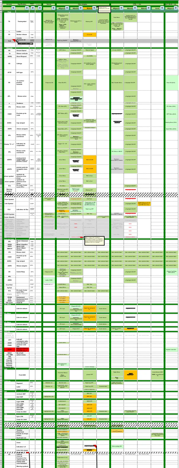
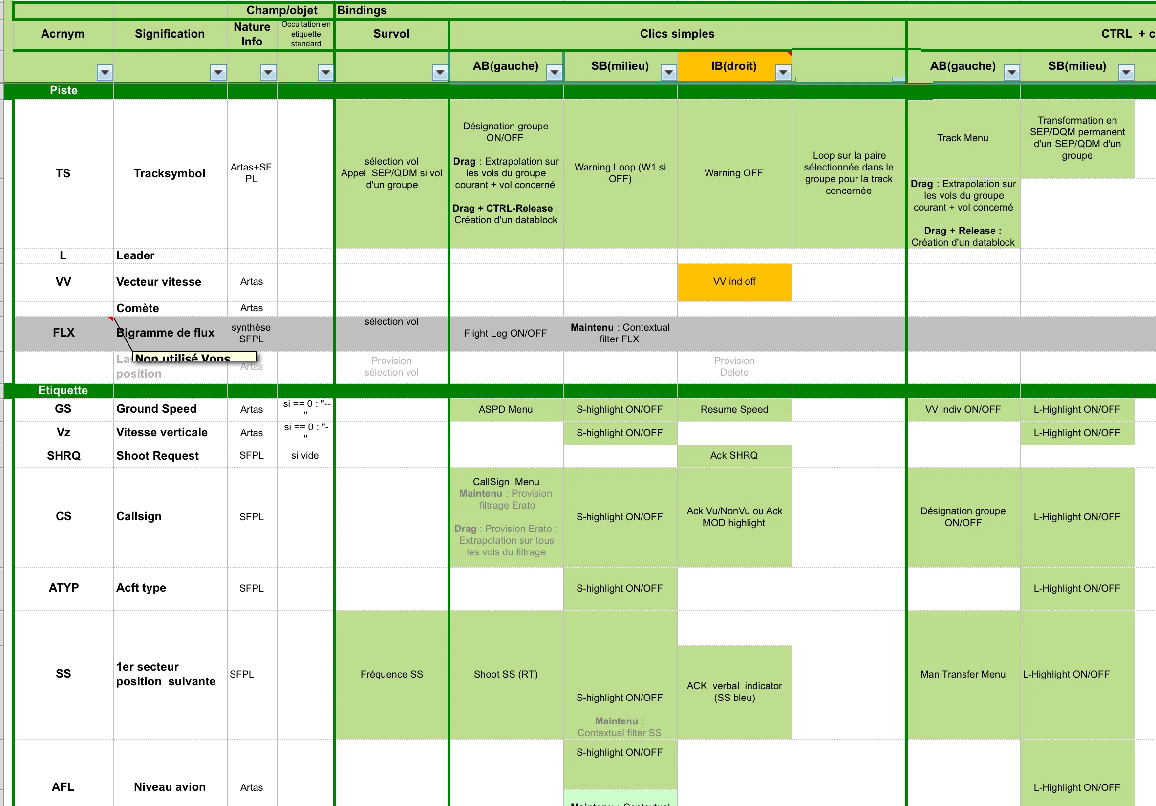
Overall results
Greatly improved the UI acceptance, better appropriation by the users:
- New issues were due to new features being introduced rather than basic usability problems
- Better readability of the UI / better interpretation of the data
- Decreased the inputs errors, like unexpected user clicks deleting some data
- Learning was facilitated - with interactions now easier to recall
The 4-Flight experience became more consistent on various levels: general behaviour, UI components, input methods, etc.; added hierarchy in the colour palette.
A coherent and enjoyable experience was easier to accept for the controllers.
Switching to an iterative design process
Issues - an ineffective design process
- DSNA didn’t have effective ways to explore/iterate on design options
- The live prototype was only managed by the provider
In workshops
- We mostly relied on ppt presentations, with little visual support
- Some controllers built their own flash prototypes to share their ideas.
- Even though this was a nice initiative, this was leading to frustration.
- Indeed, the users were too creative and didn’t take technical limitations into account. So, most of their proposals were dismissed.
Working on the live prototype, the pace of improvement was limited:
- We had weekly sessions pointing out to the provider a batch of issues to be resolved
- But the prototype was only managed by the provider. So, we then needed to wait for a week before checking the changes had been correctly understood and implemented.
- A quicker way to iterate was missing.
I thought it was time to introduce new design artefacts and ways of working.

Actions
I created a high-fidelity static prototype of the radar image (SVG).
- I started replicating a screenshot of the initial ‘live’ prototype.
- I included the full range of UI components
- I gradually included more layers to explore ideas on the various features/topics
Using this high-definition mockup, our internal design process was greatly improved.
Result - improved workflow
This digital version allowed us to iterate internally, and helped us:
- Explore more ideas, converging more quickly on a preferred solution for our workshops
- Brief the provider more precisely on our expectations (during our fast-track usability improvement tasks)
- specify the industrial version in a better way, by illustrating precisely the required UI components
Visual design
Colour scheme
Issue - Lack of consistency and hierarchy in the use of colours
The prototype was a combination of features pulled from various previous systems. So each element inherited a style from its original product. On top of that, development teams had chosen most colours, i.e. starting with pure R, G, B and then using magenta, cyan, etc without more thought.
Action - redefined the entire colour scheme
I ran many iterations on the entire colour set. I took into account:
- The need for a global rationale
- Human perception, as we were designing for critical activities…
- I used a colour hierarchy based on the CIELAB ΔE* colour difference
- This meant UI elements with a relative difference in “importance to the users” were perceived accordingly (e.g. flights currently under the controllers’ responsibility vs. the ones that will be; or vs. flights “of interest”).
- Historical colour scheme preferences
- The controllers were already trained and used to detect some hues as being associated with specific tasks in the existing system
- Aesthetic preferences from the user group

Feedback from a senior DSNA stakeholder who witnessed the changes after a few weeks:
“I don’t know what you did, but I find this radar image really pretty now. I love it!”
- Head of Human Factors-
Result - A consistent set of colours
Transformed an ill-designed colour scheme into a rationalise one:
- using salient colours sparingly
- allocating colours appropriately: e.g. associating carefully chosen hues only to specific tools or scenarios
- Describing the logic behind the choices
- Stating how to pick new colours in case more tools were to be added

A note on accessibility
ATCOs are an unusual user base when talking about accessibility.
A bit like pilots, before joining ENAC university, their perception is assessed. Only students with good visual acuity can carry on this path. They can’t be colour blind for instance or have some other visual impairments.
As a consequence, this was taken into consideration in my designs. I was less worried about some colour perception issues, even allowing some elements to have closer lightness levels (than WCAG level AA standards for example) when/if needed.
Iconography
Issues
- New features required new icons
- Symbols and icons from the initial UI needed more thoughts
Action - I iterated on a set of new icons and symbols
- Involved operational experts
- Making icons easier to recognise (rather than recall)
- Worked with many constraints:
- Tiny raster image 22x15 px, allowing only 2 colours (foreground / background)
- Preferred icons due to historical use (for instance, I aligned the ‘warning’ icons with the ones from the current ATC system)
- Reserved symbols used elsewhere in the product
- Various individual aesthetic preferences to take into consideration
Result - a consistent set of icons
- using relevant metaphors
- matching more with the user's mental model
Examples:
- "Handwritten ‘e’ or ‘x’ characters” icons: used to indicate a flight data had been manually overwritten
- Speech bubbles: consistent used for all dialogues, irrespectively of the conveyed message (acknowledgement, acceptance, rejection etc.)
Specific features
Dialogue feature
Issue - One of the new “digital dialogue” features wasn’t usable in its first version.
This new feature allowed controllers to initiate a dialogue with colleagues managing a nearby area.
The original sequence was cumbersome: end-to-end, it required 12+ actions to request a change on a given flight.
Actions - I simplified the flow
- Reduced the number of steps down to 6 actions
- Homogenised all ‘dialogue-related’ flows, using the same paradigm and components
Results - Users better understood all dialogue tools
- Allowed them to collaborate digitally and more efficiently with external positions by spending less time in these flows (knowing that the time spent on a task is closely monitored for critical activities).
- Reduced the learning curve for this new tool
Agenda
Issue - The agenda feature hadn’t been entirely designed
Action: proposition of graphical and interaction design improvements (within acceptable changes defined by the provider)
- Graphical consistency with the rest of the UI
- Reduced wasted surface
- Improved visual hierarchy, making the most relevant data more salient
- Better visual separation of data vs. tools
Result:
- Improved readability of the agenda content
- Various areas and functionalities better delineated
- Consistent colour usage with the rest of the UI
Human factor recommendations
To replace the paper strips and support the control activity, many new ‘4-flight’ functionalities were introduced (e.g. digital tools to measure flight distances; to extrapolate paths; or to mark, prioritise and share potential conflicts).
Issue 1 - All shortcuts weren’t supported by standard input devices.
Users needed a way to trigger their priority tools and functions via a keyboard. Air Traffic control being a critical activity, we wished to avoid modal interactions as much as possible (i.e. shortcuts using key modifiers, like Ctrl+Shift+Z).
Action
I sourced bespoke keyboards and iterated on the best layout for the shortcuts:
- I launched a pre-study for selecting new devices allowing direct access to the shortcuts.
- I sourced and reviewed available keyboards on the market.
- I enquired about the technical feasibility of plugging such devices into the system.
- I assessed with users whether this was answering their needs
- We iterated on the layout to group functionalities in the most effective way
- We left space between groups to avoid keystroke errors.

Result - new devices with a custom layout
The new keyboards embedded 2 lines of extra customisable keys.
The added value was as follows:
- Controllers could access their tools via keystrokes when required.
- Improved speed: using isolated and dedicated shortcuts. Selecting tools quickly is required in some ATC situations.
- Better discoverability of some tools (vs. invoking them via mouse interactions on screen)
- Users could operate faster once they became experts.


Issue 2 - DSNA needed support for selecting new monitors.
New ‘4-flight’ functionalities meant we needed more screen space to accommodate them.
A new display setting had been agreed upon: a main monitor (1:1 ratio) would display the radar image while controllers could deport secondary tools on another one. This setting differed from the current CAUTRA system (relying on a single monitor for the radar image - a smaller, standard 16:9 display). We needed to evaluate new displays for this setting.

Action - Evaluated and selected new monitors
From my PhD studies, I had a good knowledge of colour management and display technologies. I used these to establish a comparison process (we used a colourimeter for monitors). We then evaluated displays from three providers using this guideline.

Result - a good new monitor for the radar image
The selected monitor had the best compromise in terms of cost, reliability, display quality (under various lighting conditions), and colour consistency.
Issue 3 - DSNA needed advice on the overall workstation setup.
Introducing 4-flight also had an impact on the workstation: the controllers didn’t use strips anymore, and the monitors need changes. This meant the furniture used in the area control centres also needed to evolve.

Action - advice on the future controller's workstations
- A prototype of the workstation was delivered to the DSNA. I got involved in its evaluation process.
- I analysed various aspects of the workstation
- the dimensions of the furniture, its max depth
- the arrangement of the keyboard
- the distance between the two controllers working on it
- the position of the monitors and communication devices, etc.
- Although it’s not my field of expertise, I provided Human Factor and Ergonomics recommendations.

Result - furniture improvements
Managed to avoid ergonomics and collaboration issues we detected on the original prototype.
Constraints and challenges
A difficult starting point
As described earlier, we started with many disparate features bundled together, and negative feelings from the end-users on this product.
4-flight started on the wrong foot: the project wasn't anywhere near users’ acceptance after the first provider’s demo. This was a challenging start.
Technical limitations - working with older technologies
Older techs are robust, this is a safety requirement when working in critical environments. Unfortunately, they come with limitations in terms of graphical rendering capability, or UI toolkit flexibility.
Political battles and Resistance to change
Controllers from the five “en-route” control centres attended our workshops and sessions on the prototype (coming from Reims, Aix-en-Provence, Bordeaux, Rennes and Paris). They had been briefed on the purpose and conduct of co-creation workshops. They were willing to help. Some of them even built flash prototypes to share their ideas.
Unfortunately, meeting with colleagues from other centres meant they had to make compromises. Because of geographical differences, the fluxes they were controlling in their respective centres were quite different. As a consequence, their ways of working were different too. This was quite an unexpected eye-opener for them. Controllers are used to having a lot of power in their work environment, so they weren’t prepared to or inclined to make compromises.
We had to deal with some tensions to make them converge on specific topics (for instance the structure and layout of flight labels), or when the changes introduced by 4-flight were too far away from their current systems. By making compromises on both sides, we managed to deal with this dangerous ground.
There were also some ongoing political games with the provider, as they had sold an “off-the-shelf” solution at a given price, but DSNA was requesting many changes. Some difficult negotiations at the product level and feature-by-feature took place.
Fast pace
4-flight was and still is a top-priority programme for the DSNA. The previous en-route control systems need to be dismissed so France fully integrates the “Single European sky”.
Time pressure was huge during the definition phases, with over-ambitious timelines. In reality, it took a few extra years to release the first operational version. But at the time, we were still aiming for an official release in two to three years, so we took a lot of decisions in a very limited time. This meant we couldn’t explore or validate solutions as much as we’d have liked to.
Progressing the project at pace also depended a lot on the end-users acceptance…and the French Air Traffic Controllers (ATCOs) are very demanding users. They know what they want and have the power to ground most of the traffic if they aren’t happy. So we were on a fine line balancing their expectations and the project timelines.
Results
Acceptance from the controllers
It wasn’t an easy ride, but by improving the prototype and making it usable and desirable, we got to a user’s acceptance. This was a key milestone for the project.
Definition of the industrial version
Our changes needed to be integrated into the “industrial” branch. It wasn’t easy to translate these into requirements for such a complex system (lack of structure to correctly define and capture some UI-related content).
4-flight was delivered and an overall success
- In 2017, 4-flight was used to control 'real' flights for the first time.
- Currently (second half of 2022), it’s being deployed on half of the French territory.
Starting from a suboptimal prototype, we managed to transform 4-flight into a usable and safe product. French ATCOs are now using it to perform “strip-less” control on one of the most complex territories in the EU (given the number and density of fluxes over France).


Learnings
This time spent on 4-flight was my first ‘work experience’ after a few years in the academic field. I learned many things:
Ignorance is bliss
I didn’t realise it at the time but this was a very rich and intense experience for a ‘junior’ consultant. I was lucky to wear many hats (Product designer, PO assistant, BA, Researcher, testing platform engineer, and probably others). Quickly, I also got a high level of trust from my DSNA clients. As we were a very reduced team, I ended up having a significant impact on the final product. It was probably for the best this was my first consulting experience given the pace at which we were taking decisions. Nowadays, I’d be fairly worried about some of the decisions we made then.
Wearing too many hats can be uncomfortable
At the same time, I was honoured to play a significant role in this project, but I also felt I should have delegated or refused to take on some of my “duties”. I later worked on projects with much more specialised roles, on which I learned to appreciate having field experts to collaborate with.
Politics gets in the way
As mentioned in the constraints section, this project had a very prominent political aspect. In some ways, this was a baptism by fire for me. I learned how and when to make compromises, which battles are worth fighting, etc.
Bundling features together doesn’t make a product
This was more a confirmation than a ‘learning’.
The process to get to the initial prototype was strange compared to the established design industry ones. The end-users, the controllers, picked a list of features (implemented and live in other countries, or brand new) from a catalogue. The provider then mixed and matched those on the first version of the 4-flight prototype and presented it back to the users. Unsurprisingly, this wasn’t far from being a disaster. Luckily the DSNA had planned to follow an ‘agile’ process to get to a usable prototype…